It’s been some years since its inception now but the 'Graph of Doom’ continues to be relevant as an illustration of where the future might lie for local government and how something will need to be done about it.
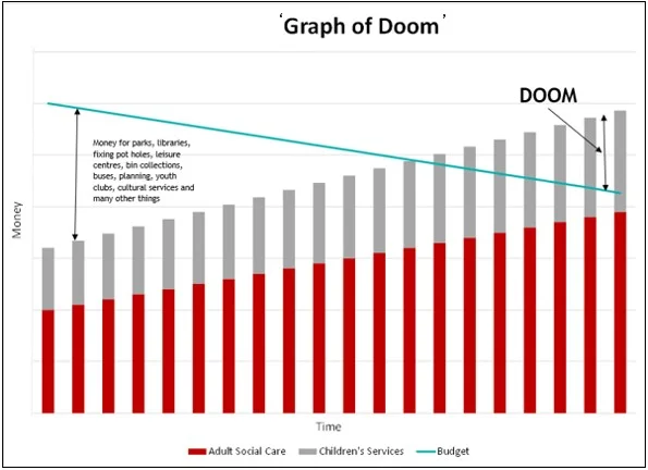
For those who are unfamiliar with this: the ‘Barnet Graph of Doom’ was originally a slide in a presentation by Councillors from the London Borough of Barnet given in 2011. It showed that if historical patterns continue for adult social care costs, children’s services costs and the budget the council has there will be no money left for anything else. There are now several versions of this graph (do look it up on your preferred internet search engine). For your benefit I have provided a very simplified version of my own below:

The general concept is not specific to Barnet but is intended to be representative of all UK local councils. It is not a prediction of what will happen, but it does demonstrate what could happen if trends continue.
Adult social care and children’s services are statutory services for local authorities. They have to be provided under current law. The nature of these services is that they are demand lead: if an individual needs care this has to be supplied by the Council, who have very little control of how many people will need care and how much care they will need. The UK has an aging population* so more people are living longer (good thing) and will need more social care. Improved medical care has also meant children and younger adults with serious disabilities or health conditions are living longer (also a good thing) so these individuals will also need more social care. This is all expected to lead to increasing costs in future years. More recently rises in the minimum wage and national insurance contributions are also expected to increase these costs. Added to these two categories SEND (Special Education Needs and Disabilities) funding is a further statutory cost to local authorities that has become very significant later than 2011 when this graph was made.
A council’s budget or money to spend is of course dictated by its income. This comes from a number of sources but primarily this will be council tax, business rates, central government grants and fees and charges. This money has at best been ‘constrained’ in recent years and is expected to continue to be in the future. Historically councils have experienced real terms falls in their income, particularly through the austerity years (approximately 2010 – 2016) where central government grants were cut and council tax increases were restricted to 2% without a referendum. This is illustrated by the reducing ‘budget’ line in my graph.
Predictably if costs keep rising and income keeps falling there will stop being any money for anything. Some of the non-adult social care or children’s services costs are also statutory, such as household waste collection and basic road maintenance: so money will still have to be found for these somewhere. What will be squeezed, or if the graph happens literally disappear, will be the ‘non-statutory’ or ‘discretionary’ services that councils provide. These are things such as libraries, parks, leisure centres, youth clubs and local events. These are typically ‘supply lead’ at least to an extent: a council can choose how many libraries it has and when they are open for example.
Whilst you could argue that libraries, parks and leisure centres may not be as essential as an adult or child needing care, in the society that we live in residents generally expect that there will be these things somewhere where they live. Whilst some people clearly use these council services more than others everyone will have used a park, library or council leisure centre at some point in their lives. Accepting the status quo continuing to the future will, in extremis, mean we have to decide to live without any of these things: the ‘doom’ that the graph illustrates.
So ultimately something will have to give. Councils can and have cut back on non-statutory services - less libraries and leisure centres, parks in worse repair, the closure of council nurseries and children’s centres being just some examples. The size of the bars for adult social care and children’s services could be reduced although this would be a challenge (that aging population thing again). Robots that can care for our elderly much cheaper than carers have yet to be invented, even if they were desirable. In the future central government decisions on spending and taxation, or encouraging people to save more for future care cost, may help although these often prove unpalatable with the electorate.
Ultimately the ‘budget’ line has improved from the worse expectations of this graph, in that many Councils are now able to raise council tax above the previous 2% level and there has been easing of ‘austerity’ from central government (even if some of the councils that we work with may disagree with us on that point!). More recently a small number of councils that have genuinely experienced the budget-cost overlap of this graph have been given 'Exceptional Financial Support’ (EFS) or capitalisation directives by central government: although this is typically intervention in one year only and would not change the long term trend that the graph demonstrates. The statutory override for SEND funding cannot last forever and will also not change the ultimate shape of this graph.
It may be 14 years old but the Barnet Graph of Doom remains a powerful visual metaphor for the financial pressures facing local authorities. It underscores the importance of addressing structural imbalances between what we want and what we pay for.
* I once heard that if you ever study biology the answer to every question is “greater surface area”. The answer to everything in economics is “aging population”.
Related Insights
Local Authority Investment Trends in 2025
How Do You Apply Capital Receipts to Reduce Your MRP Charge?